

The RGB (Red, Green, Blue) model is the core method that forms every digital image. It sits at the heart of multimedia software. Red, green, and blue light mix to control each screen pixel. Now, let us explore its software journey in depth.
A developer who masters this model delivers a consistent look across all platforms. You learn how APIs interpret additive color mixing. Stop worrying about how a user sees a button. Once you grasp the core idea, results always match your intent.
Today’s multimedia software runs complex color conversion libraries behind the scenes. You click a hue, but a huge calculation chain works in the background. Knowing each link in this chain lets you fix render bugs quickly. Let’s dive in and unravel this engineering marvel step by step.
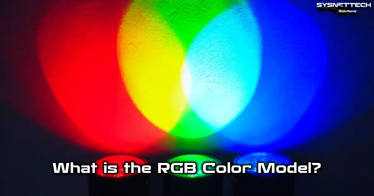
What Is RGB (Red, Green, Blue)? Core Definition and Its Role in Multimedia
The digital image world’s alphabet relies on adding red, green, and blue light. Within multimedia software, this model is the native tongue of all screen-based apps.
Video processing libraries and graphic design tool engines build the final picture through these three channels. Similarly, web browser CSS parsers and game engine pixel shaders work with them.
It mirrors the human eye’s trichromatic vision. This system is a software implementation of the Young-Helmholtz theory.
For multimedia tools, this model is the heart of visual output. You add a color filter in a video app. It runs code that tweaks brightness values.
When you write CSS for a web app, you tell the browser’s graphics engine the intensity of these three lights.
Thus, every digital imaging tool has a simulation layer that mimics this core physics. The better the simulation, the more accurate and consistent the UI render.
These three lights match specific visible spectrum wavelengths. They serve as data channels for software. Each pixel’s color information is stored in memory buffers using numeric values for all three channels.
Digital signal tools process these number sequences. They boost contrast, adjust white balance, or apply custom filters. Every multimedia tool you use is a software library built on the RGB channel.
The RGB Expansion and Physics of Additive Tone Mixing
RGB stands for red, green, and blue. This abbreviation refers to the additive color model.
A software algorithm computes every color in this system. Three light sources blend at different strengths. When you turn off all three, the app shows pure black.
Conversely, setting each channel to its maximum gives you pure white. This is the opposite of paint logic. The software controls this by writing values to a pixel buffer.
When you paint, you subtract colors. However, in a digital setting, you add light. That is why we call it additive synthesis.
For instance, in a graphics library, mixing full red and green light makes your eye perceive pure yellow. This is not a physical mix but a biological illusion. The software simulates this illusion exactly.
The CIE 1931 color space diagram maps all human-visible colors scientifically. Inside this large diagram, our three primary colors form a color triangle.
That triangle sets the color gamut your software or file format can cover. A wider gamut means the tool produces more vivid digital illustration colors.
Tristimulus values give each color a mathematical formula based on these three main components. Multimedia tools use these values to define and handle colors objectively. That is the core of the additive model: a non-linear blend of three separate channels.
Graphics Engines and OS-Level RGB Pixel Processing
All multimedia rendering software sends the final output to the screen through a pixel-based buffer. Each pixel is a software abstraction of three sub-pixels managed by the graphics driver.
These sub-units stand for the red, green, and blue components. The operating system’s graphics stack passes app commands to these physical units. For example, DirectX on Windows or Metal on macOS handles this task.
From a code perspective, pixel density and sub-pixel layout directly affect font rendering engines. These engines rasterize text based on such parameters.
For instance, a web browser’s graphics engine uses sub-pixel hinting when processing TrueType fonts. This method makes typefaces sharper and easier to read. However, this improvement can cause color fringing across different OS graphics APIs.
Why do tools favor the additive model over subtractive paint logic? A screen is a light source, and the graphics engine uses this to its advantage.
You can simulate any color within the light spectrum by mixing RGB. The display signal carries this three-channel data in sequence. That is why all modern visual media formats rely on this structure.
How the RGB Color Model Works: 0-255 Values, HEX Codes, and Digital Use
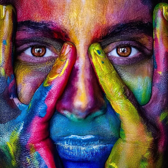
You open the color picker component of a multimedia app. You see three sliders, each going from 0 to 255. These components set the 8-bit depth of each tone channel. They pass these values to the app module.
This means 256 separate intensity levels per channel. We call this 24-bit color or True Color, giving 16.7 million colors. All modern content creation pipelines build on this standard.
The app reads 0 as the channel being fully off, and 255 as maximum brightness. For example, suppose you set a background color in a web app’s CSS file. Writing rgb(255, 0, 0) tells the browser engine to render pure red.
This number logic forms the base of digital image processing and computer graphics algorithms. Even when generating art with AI, you feed such numeric tensors as model input.
In web and software development, you often see HEX codes. These two systems simply show the same 24-bit color information in different string forms.
Developers know both the function notation and hex codes well. They complete API integrations quickly. The conversions are extremely straightforward. Most IDE plugins handle them for you.
How to Calculate RGB Values: Step-by-Step Examples
Color math is quite intuitive, and software makes it effortless. In a color picker dialog, you can instantly read the values of any tone your eye perceives.
However, if you want to create a color with code, you take a different approach. You pick a number from zero to 255 for each channel. Writing these three numbers with commas in a sequence gives you a unique pixel color.
For instance, let’s set a warm orange in a video editing tool’s subtitle engine:
- Keep the red channel high to bring in warmth (for example, 255).
- Set the green channel to a mid-level to capture the orange tone (for example, 140).
- Turn the blue channel all the way off (0).
- Save it as (255, 140, 0) in the tool’s profile configuration file.
Professional tools go beyond this number logic, offering more intuitive interfaces such as HSL or HSV.
With the hue-saturation-lightness model, you give “make darker” or “make more vivid” commands. The HSL link is invaluable in video color grading plugin workflows.
rgb() function in CSS, pick the new no-comma syntax: rgb(255 100 50). This style fully avoids compatibility issues. It also yields a cleaner codebase.Color coordinates form a 3D space where software places hues. Each tone has a unique address inside this large cube.
Whether you define a material in a game engine or build a heat map with a data visualization library, this addressing system always operates in the background.
HEX and RGB Coding Standards in Software Interfaces
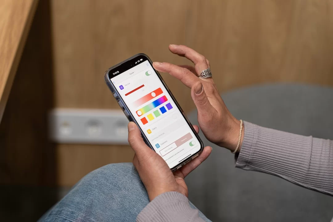
HEX codes are a string notation that shows the same 0-255 values in base-16. This is the standard for color configuration in web and desktop app UIs. In the RGB model, these values range from 00 to FF.
You use the first two characters for red, the middle two for green, and the last two for blue. For example, to set pure blue in a CSS module, write #0000FF.
To convert quickly, nearly all IDEs and design tools have a built-in converter. You move a slider, and the app instantly shows the HEX match.
Converting HEX and RGB codes is the first step to cross-platform color consistency. Any SDK’s color definition constants must include both formats.
| Color Name | RGB Value | HEX Code | Common Use (Software) |
|---|---|---|---|
| Pure Red | (255, 0, 0) | #FF0000 | Error message components, record button |
| Vivid Cyan | (0, 255, 255) | #00FFFF | Cyberpunk themes, terminal highlights |
| Rich Purple | (128, 0, 128) | #800080 | Live streaming tools, premium interfaces |
| White | (255, 255, 255) | #FFFFFF | Backgrounds, negative space |
| Pure Black | (0, 0, 0) | #000000 | Text, cinematic borders |
You can use hex color notation directly as a parameter in AI service APIs such as Midjourney and DALL-E. This simplifies control over AI image generation colors.
Hex code notation is very compact. Developers often store it in configuration files and database records.
RGB vs. CMYK: Which One Should You Use and When?
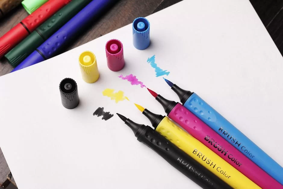
The biggest confusion begins here. Should you set up your project’s render engine for RGB or CMYK mode?
The answer is clear: always use the additive model for digital media, screens, and video output. However, your project might include a print preview module.
Only then should you switch to the subtractive world of CMYK. The core difference affects the color math: one adds light, the other takes it away.
Graphics software lets you toggle between these two modes. However, this toggle is a guess made by the ICC profile conversion engine. Therefore, it always causes some pigment loss.
If you ask what the differences are between RGB and CMYK, the answer is straightforward: you attempt to turn a light-based world into an ink-based one. No printing press can produce the bright neon green you render on screen.
When you compare color gamut volume by percentage, the digital model is much wider than print.
In a professional software workflow, you should start the design with print colors. Alternatively, you can perform a controlled color switch later. Out-of-gamut color warnings are the most vital visual feedback a tool gives at this point.
How to Avoid RGB to CMYK Conversion Errors
A color shift during conversion is almost certain. However, you can minimize the loss with your software’s profile management tools.
First, pick the right color profile in your design tool’s project settings from the start. If print output is the goal, launch the project directly in CMYK mode. This provides an accurate preview immediately. It also prevents unexpected late-stage issues.
Activate the “View > Gamut Warning” feature in Photoshop’s color management module. This feature marks problem colors for print with gray.
Also, use the “Convert to Profile” command for a controlled switch. The hue space conversion matrix activates here. Then, the software uses gamut mapping to ensure minimal loss.
Another professional method is using soft proofing. This feature matches your monitor profile with the print profile. Thus, the screen simulates the print output.
Color gamut compression techniques form the base of this simulation. The ICC profile you obtain from the print shop is the most critical configuration file for it.
Can You Print with RGB? Why Doesn’t Offset Use RGB?
In theory, no. You cannot send a direct RGB data stream to the printing software. Your app paints with light on screen, but the press works with physical inks.
Why doesn’t printing software use this system? On paper, you make color by reflecting light, not by emitting it.
The printing machine’s RIP (Raster Image Processor) software controls cyan, magenta, yellow, and black inks.
If you send the file to print as RGB, the RIP software performs an automatic conversion. However, you have no control over that conversion. The result is often disappointing. Therefore, you must convert to CMYK yourself before sending the job.
In short, can you get an RGB print? Due to the mismatch between software and hardware, the answer is a clear “no.”
As an exception, some digital presses have extended gamut. Their driver software manages extra color channels like orange or green on top of CMYK.
Even so, you still cannot obtain a pure light-based output. This is the most fundamental distinction between software development and physical printing.
RGB Color Spaces: sRGB, Adobe RGB, Display P3, Rec. 2020, and NTSC
A color space is a configuration setting that draws the limits of colors your software can use. Different RGB model standards serve different APIs and platforms.
sRGB is the standard color space for web and mobile app SDKs. Adobe RGB targets professional photo processing libraries. The choice between them depends on your app’s target output.
The NTSC color space is a historic benchmark from analog TV software. Today, it survives only as a comparison metric in software specification sheets.
Digital broadcasting standards are now far ahead. You set up a profile in a video encoding library. At this stage, picking Rec. 709 or Rec. 2020 defines the codec color pipeline.
The Rec. 2020 UHD standard is the most ambitious target for 4K and 8K video processing tools. It covers nearly the full spectral sensitivity range of the human eye.
The Rec. 709 standard is the backbone of HD video processing pipelines. Moreover, it shares almost the same color coordinates as sRGB. The small gamma shift between them can cause complications during video transcoding.
Criteria for Choosing sRGB vs. Adobe RGB in Software Projects
HP and Microsoft developed sRGB in 1996 as a standard profile for the internet and software apps.
This profile is the default choice for modern web rendering engines. It also often appears in mobile UIs and content creation tools.
Its gamut is somewhat narrow, but its biggest advantage is universal compatibility. If you need your app to look the same on all platforms, sRGB is the safest configuration.
Adobe, on the other hand, launched Adobe RGB in 1998 for print-oriented workflow tools. It is clearly wider than sRGB, especially in green and blue tones.
The answer to “should I pick sRGB or Adobe RGB in graphic design” depends on your end user. If you are building a professional photo processing library, adding Adobe RGB support is essential.
| Feature | sRGB | Adobe RGB |
|---|---|---|
| Gamut Width | Narrow | Wide (especially green and blue) |
| Use Case (Software) | Web, mobile apps, game engines | Professional photo editors, print preview |
| API Compatibility | 99% compatible with all platforms | Needs color-managed libraries |
| Memory and Risk | Standard | Larger buffer; colors wash out in non-managed engines |
However, here is a key point: you open an Adobe RGB profiled image in a viewer that lacks color management. In that case, colors look washed out.
The reason is that the software cannot interpret the wide gamut. Unless the image management engine activates, a wide profile becomes a problem in a standard pixel buffer. That is why you must set up your app’s color management module correctly from end to end.
Display P3, Rec. 2020, and NTSC: Modern and Historic Color Spaces
Display P3 is a profile led by Apple. It is becoming common in modern mobile OS and desktop platforms. It is a hybrid of the DCI-P3 cinema standard and sRGB. In short, it handles red and green tones much better than sRGB.
To the question “Are Rec. 709 and sRGB the same?”, we can answer “almost.” They use the same color coordinates. However, the gamma values—a critical detail for video processing libraries—differ.
The DCI-P3 cinema standard coverage ratio is the target for digital cinema mastering tools. Today, a monitor that claims “95% DCI-P3” shows it can load a wide-gamut profile.
Rec. 2020 is the peak of this race. However, no consumer software or library can fully cover this standard yet.
If you ask, “what is WCG (wide color gamut)?”, we can explain it as an umbrella term for all standards that go beyond sRGB.
NTSC, on the other hand, is now merely a nostalgic yardstick. Established in 1953, this standard laid the groundwork for color TV broadcast software.
Expressions like “72% NTSC” today actually mean that profile fully covers the sRGB gamut. Knowing this legacy from CRTs to now helps you appreciate the evolution of digital color.
Color Depth and HDR Setup in Software-Based Image Processing

Color depth shows how many distinct brightness levels your app can process per channel. It also indicates how this data sits in the buffer memory.
In an 8-bit workflow, you work with 256 levels per channel. This yields the famous 16.7 million colors, enough for most web and mobile apps.
However, this level causes problems in professional video editing and VFX libraries. It leads to color banding issues in fine gradients.
That is exactly where a 10-bit processing pipeline comes into play. 10-bit color depth offers 1024 levels per channel, totaling over a billion colors.
This large increase is essential for smooth transitions and HDR content creation inside software. Especially in subtle tonal transitions like skies, the color banding artifact vanishes completely.
The advantages of 16-bit RGB in digital art go even beyond that. It gives you a massive range for toning and retouching.
Detecting True 10-bit Render vs. 8-bit FRC Simulation via Software
Even if you set up a 10-bit workflow in software, you may get no result. This happens if the graphics driver and display API do not support this depth.
Many “10-bit” devices on the market actually use 8-bit+FRC panel technology. FRC (Frame Rate Control) is a software-hardware technique. Specifically, this technique rapidly alternates pixels between two colors to simulate mid-tones. This creates a visual illusion. However, it is not a true depth increase.
How can you tell if a monitor supports real 10-bit rendering? By querying the OS graphics API or using a professional test pattern application.
If you wonder whether your monitor is true 10-bit and how to check, you must learn to run a software banding test.
Render test patterns that show a smooth gradient from black to white. With a true 10-bit configuration, the transition is flawless. On an 8-bit+FRC simulation, you will see slight ripples and fine vertical lines.
| Feature | True 10-Bit Pipeline | 8-Bit + FRC Simulation |
|---|---|---|
| Color Count | 1.07 Billion | 1.07 Billion (Simulated) |
| Software Transition Quality | Flawless | Slight ripple, possible flicker |
| Professional Use | Color grading plugins, mastering | Game engines, general UI |
Tone Mapping Algorithms in HDR Content Creation Software
HDR (High Dynamic Range) content creation started a new era in color management libraries. Here, not only color but also pixel brightness multiplies.
If you ask which RGB space you should use for HDR, the answer is Rec. 2020 or DCI-P3, based on your project’s codec. In an HDR project, the pipeline must be 10-bit or higher. Otherwise, the software cannot prevent the posterization effect.
The 2.2 vs 2.4 gamma correction difference plays a key role here. We usually master SDR content at gamma 2.2. For HDR, we use the PQ (Perceptual Quantizer) curve.
Tone mapping from HDR to SDR is a vital step. The encoder software performs this task, so you can watch HDR content on an SDR screen.
However, you might see the desktop go pale when you turn on HDR. Actually, this issue usually stems from the OS tone mapping algorithm being incorrectly configured.
Dolby Vision and HDR10+ use dynamic metadata. Because of this, the mastering tool can optimize brightness scene by scene.
The HDR10 and Dolby Vision world gives content creators a vast canvas. Yet, using this canvas correctly has its own rules. These include a reference monitor mastering display and the right LUT file formats.
RGB Color Palette Generation and Libraries in Software Development
Building a cohesive and accessible palette for digital projects is a software and algorithmic skill in itself. Randomly chosen codes create an amateur and jarring look.
In contrast, a systematic method based on color theory boosts your UI kit’s consistency. Modern design tools and programmatic palette generators offer powerful helper libraries for this.
When picking digital illustration colors, pushing the additive model’s limits is thrilling. Neon glows and vibrant gradients are only possible with this model.
Yet, at the same time, you must not forget the WCAG accessibility color contrast criteria. A visually appealing palette can become unreadable due to low contrast.
Testing your palette with protanopia and deuteranopia simulation libraries is essential for inclusive software development.
How to Build an RGB Palette with the Color Wheel and Complementary Colors
The color wheel is a conceptual circle where art meets science. Colors that sit opposite each other on this wheel are called complementary.
For example, blue and yellow, or red and cyan, are opposites. These contrasts create a dynamic, energetic visual effect in an interface. When I build a theme engine, I set a main color and automatically calculate its complement for accents.
Analogous color schemes use neighbors on the wheel. This scheme is ideal for calm and harmonious user interfaces. Triadic harmony picks three equally spaced colors.
Moreover, this method yields lively yet balanced palettes. You can now perform all these calculations in seconds with AI-powered palette generator APIs.
If you ever must match a paint color, the task is difficult. Physical paint and digital code do not align one-to-one. There are special mobile apps and reference swatches for this. Still, the best approach is to mix the paint physically and match it by eye with a digital reference.
HSL vs. RGB in CSS: Which Is Better for Web Design?
You have two popular syntax choices for styling in web development: the RGB function notation and HSL.
Which is better for web design, RGB or HSL? The answer depends on the styling engine’s needs and code readability. However, HSL is closer to how humans think. When you say, “I want a slightly darker blue,” simply lower the lightness variable in HSL.
To do the same in the function notation, you must reduce all three channels proportionally. That is not intuitive and raises the error rate. Despite that, the rgb() function is still the most common method.
In terms of performance, the HSL vs. RGB comparison in CSS is almost equal. The browser’s style engine processes both instantly. In addition, the RGBA alpha channel is the cleanest way to add transparency.
In modern projects, I prefer HSL for its high readability. It is invaluable when creating theme variables. Yet, in terms of software resource use, there is no difference. It entirely depends on what feels more comfortable for you and your team.
End-to-End RGB Setup Chain in Multimedia Software
The biggest challenge for content creation tools is keeping color consistency from input to output. This is because a different library and profile are used at each link in the chain.
The camera SDK, the editing engine, the color grading plugin, the streaming encoder, and the viewer’s player application all must use the same color space configuration. Conversely, a multimedia color accuracy workflow on a computer forces you to practice strict configuration management.
What profile does your camera app provide as raw data? Did your video editing engine correctly inherit the project settings? Does your OBS streaming software preserve color data during transcoding?
Each of these questions marks a break point in the chain. Using RGB on multimedia devices only makes sense when you give clear answers to them.
Syncing RGB Color Format in Broadcasting and Recording Software
First, set up your camera SDK with the right pixel format. If you plan to do heavy color correction later, choose a flat (log) profile.
For a lossless RGB setup in OBS streaming software, the critical steps are:
- Go to the “Advanced” settings menu in OBS.
- In the Video section, pick NV12 (common) or I444 (high quality) as the color format.
- Set the color space to Rec. 709.
- Instead of the limited 16-235 range, choose the full 0-255 range for computer screens.
To keep the OBS stream RGB setup lossless, set chroma subsampling to 4:4:4. 4:4:4 chroma subsampling is vital for text sharpness.
Especially when sharing a presentation or a code screen, 4:2:0 subsampling makes text look blurred. To fix video rendering color shifts, check your delivery codec settings.
Fixing the Color Shift When Saving in Photoshop: The ICC Profile Solution
This problem stems from profile mismatches in digital design tools’ render engines. The image you worked on for hours looks pale and dull once saved and opened in a browser.
However, the culprit is usually the embedded ICC profile. We will apply the fix steps in order:
- In Photoshop, go to “Edit > Color Settings.”
- Choose sRGB as the working space (if it is for the web).
- Set color management policies to “Embed Profile.”
- In the “Save As / Save for Web” window, check the “Embed ICC Profile” option.
- Check the result with “Proof Colors” in the preview.
Indeed, the fix for the color shift when saving in Photoshop is this simple. If the monitor profile is loaded incorrectly, you must pick the correct ICC profile at the OS level.
If the same HEX code looks different on another device, there is a profile mismatch somewhere in the chain.
LUT File Formats and Color Correction in Video Editing
A LUT (Look-Up Table) is a mathematical array that transforms one set of colors into another. Among LUT file formats, .cube, .3dl, and .look are the most common.
These files handle everything from technical transformations (log to Rec. 709) to creative filter effects. For video editing with RGB and Rec. 709, a LUT is a vital part of the effects engine.
In a professional workflow, you first apply a technical transform LUT to the camera log footage. Next, you perform creative color grading.
Finally, the required color space conversion matrix is applied for delivery. If you work with a reference setup that has a low delta E value, you get predictable outcomes.
Getting the Exact Color You Want in Midjourney and DALL-E with HEX Codes
Generating images with AI is now a core part of the software development toolchain. Yet, describing the color you want to these service APIs is not always easy.
Using hex color codes in Midjourney and DALL-E gives you fine control. Add a hex code directly into your prompt. Thus, you initiate the AI image color control process in a programmatic way.
The process of achieving a specific color with AI requires some trial and error. The model might not perfectly match the main color at times. In this case, I suggest adding the color to the prompt again with new contextual clues.
If you ask how to perform RGB color correction with AI tools, follow this method: import the generated image into an image processing library. Then, adjust it with classic filters. This is still the best approach.
In deep learning, we perform color normalization and use convolutional neural networks for color processing. Because of this, these tools will yield far more consistent results soon.
Software-Based Screen Calibration and ICC Profile Management
The most crucial step in a color management system is software calibration and profile assignment. Yet, we neglect this step the most. Owning an expensive monitor is not enough; you must load the right ICC profile into the OS.
With methods for calibrating a screen without a hardware calibrator, you can achieve a significant improvement initially. Use your operating system’s built-in tools for this.
Remember, color adjustments you make in a viewing context without a reference are essentially guesswork.
For software calibration, first adjust your room lighting. A dim, neutral light is ideal. Set the white balance and color temperature to the 6500K (D65) standard.
Additionally, set the brightness to a value between 100-160 cd/m² based on your room lighting. These steps also help the software highlight the color accuracy differences among IPS, VA, and TN panels.
Windows and macOS OS Calibration APIs
Both operating systems offer surprisingly functional calibration wizards and APIs. We will run through the steps to calibrate screen color on Windows and Mac. For Windows:
- Type “Calibrate display color” into Start and open the wizard.
- Carefully follow the gamma, brightness, contrast, and color balance steps shown.
- For gamma, adjust the slider until the dots become invisible.
- Set brightness and contrast based on the sample image.
- In color balance, adjust the red, green, and blue channels until the gray tones look neutral.
For monitor color calibration on macOS:
- Go to System Settings > Displays > Color Profile tab.
- Click the Calibrate button and follow the steps.
- macOS’s wizard also provides white point and gamma options.
- On both operating systems, once done, save the profile and set it as the default.
Loading an ICC Profile and Color Management System Settings
You must load the ICC profile you downloaded from the monitor manufacturer’s website or created through calibration into the system.
To load an ICC profile for Color Management in Windows, go to Control Panel > Color Management. Here, pick your monitor as the device and use the “Add” button to include the profile. In the same window, do not forget to “Set as Default Profile.”
The image management engine will now use this profile to send correct color information to applications. You are wondering whether to pick sRGB or Adobe RGB for graphic design. Right at this point, answer that question based on your workflow software.
If your monitor supports hardware calibration, load the calibration into the hardware LUT on top of the software profiles. This provides the highest level of accuracy.
RGB in Image Processing Engines and Digital Broadcasting Protocols

This three-channel model has its most complex software applications. Specifically, image processing engines and digital broadcast protocols are among them.
RGB technology in multimedia architecture uses two main strategies to handle the video stream. First, there are parallel pipelines where three separate color planes are processed simultaneously. This approach is common in video chat tools and live stream encoders.
Using RGB for color image segmentation in image processing libraries ensures vivid and natural colors.
On the broadcast side, protocols like SDI and NDI now carry uncompressed signals. This way, the luma and chroma information inside the video signal does not degrade.
On the other hand, the best RGB settings in video processing are always lossless or minimally lossy codecs.
Color Space Choice and Conversion in Image Processing Algorithms
In image processing projects, you must strike a balance between speed and accuracy. Parallel pipelines offer high color precision and low latency.
Real-time filter applications and AR software especially benefit from this method. Sequential pipelines, in contrast, run with lower resource usage.
Modern APIs blend the best of both approaches. New technology like quantum dot QD-OLED RGB color volume is available. Because of this, image processing algorithms now operate in a wider gamut.
As a result, multimedia tools deliver a color richness never seen before. Conversion algorithms manage the shift between this wide gamut and the standard one.
| Approach | Color Processing | Latency | Advantage | Disadvantage |
|---|---|---|---|---|
| Parallel Pipeline | Simultaneous RGB | Low | Vivid colors, real-time | High memory usage |
| Sequential Pipeline | Sequential RGB | Medium | Low resource usage | Risk of color artifacts |
Further Reading to Understand Color Models in Depth
The RGB model is one of the digital world’s building blocks. Still, extra resources are vital to grasp the topic more deeply. The sources below will provide expert perspectives and technical details.
- MDN Web Docs – CSS Color Values: Details how color coding works in web standards and how browsers parse colors.
- Wikipedia – Additive Color Model: Explores the physics of mixing light, its history, and uses in screen tech.
- Britannica – Color Models: Summarizes scientific color definition methods, standard systems, and engineering uses.
- Adobe – Intro to Color Modes: Teaches what different color spaces mean in design software and the right conversion steps.
- Intel – Color Spaces and Processing: Explains the math behind color components and their matches in image processing libraries.
FAQ on RGB Color Management
What is the core difference between RGB and CMYK?
Why do monitor colors look different on a phone?
Why does the desktop look pale when I turn on HDR?
Why does the same HEX code look different on various devices?
Which is better in CSS, RGB or HSL?
Can I match a paint color from an RGB value?
How can I tell if my monitor is true 10-bit?
Is RGB blue light harmful? Does night mode affect color accuracy?
Are Rec. 709 and sRGB the same?
Which color space should I choose for a multimedia project?
Conclusion: Why Understanding RGB Makes a Difference in Multimedia Production
Learning the RGB color model gives you a new engineering perspective in the digital world. You now know exactly why color shifts, pale output, or inconsistent streams happen.
Moreover, you have the software configuration methods to fix these issues. From now on, you can design your workflow with this awareness from start to finish.
Remember, color accuracy in multimedia content creation is not merely a technical detail. It shows the professional quality of your app.
Applying this standard in the best way in every software library you use is your engineering signature. Whether you build a material system in a game engine or write a video encoder, the core rules stay the same.
Color science never stops moving forward. Metaverse and virtual reality color profiles will be the standards of the future. Additionally, dynamic metadata systems like Dolby Vision will join those standards.
Yet, the additive principle of these three primary lights will endure. It will remain the building block of digital display software for many years to come.

Be the first to share your comment