

You sent a file to the print shop. The result was a total disaster. Colors came out dull. Blue turned purple. Black looked like gray. That was the moment you stepped into the CMYK world.
This subtractive color model is the foundation of printing. It uses four inks: cyan, magenta, yellow, and black. Each plays a different role on paper. Plus, knowing how the RGB color model works helps you grasp the difference.
To answer what CMYK is: it is a pigment-based color system. It does not produce color by reflecting white light. Instead, it absorbs light. That is why we call it a subtractive color mix.
Even in the digital age, CMYK printing is vital. You see it everywhere from business cards to catalogs. It is the only way to move what you see on screen onto paper. Also called four-color process printing, this method is the backbone of color press work.
You cannot picture color printing without this model. Screen color and print work in totally different ways. You must grasp that core split between light and pigment. This is exactly where the CMYK color space comes into play.

What Is CMYK? Basics and History of the Subtractive Color Model
CMYK answers a need as old as printing itself. Early color print tests used only three colors. In theory, mixing cyan, magenta, and yellow should give black.
However, in the real world, the result was always a muddy brown. That is when black ink stepped in. Print quality jumped right away. So, the CMYK color model is built on this four-way teamwork.
The CMYK breakdown stands for Cyan, Magenta, Yellow, and Key. For those who wonder what the acronym means, that is your answer. These four letters are the alphabet of the print world.
People use this model, also known as a subtractive color system, everywhere. Today, we prefer this system for everything from offset to digital printing. In fact, it is the basis of the four-color process. In other words, it is a must for modern print shops.
CMYK Breakdown and How Subtractive Color Mixing Works
The letter C stands for Cyan. M stands for Magenta. Some sources also call it fuchsia. Y stands for Yellow. The last letter K stands for Key, the key color.
Subtractive color mixing works like this: white paper reflects all light. When you print cyan ink on it, that ink absorbs red light. As a result, your eye sees cyan. So, this subtractive model is simple but brilliant.
Next, you add magenta. This ink layer then absorbs green light. Only blue bounces back. That is how you get the color blue. This is why we call it subtractive color mixing.
Mixing all three main pigments—cyan, magenta, and yellow—should give black in theory. However, the real world is different.
Inks are not perfect. Meanwhile, you should know these theory limits even when prepping your PNG files.
In this pigment-based mix, you get a muddy brown instead of pure black. That is why you also add black ink for the four-color process. Print quality improves this way. Details also become sharper.
Subtractive color mixing appears all around you in daily life. Your printer works on exactly this principle. Any device that mixes ink uses this logic.
Why Does ‘K’ Stand for Black? The Key Plate Concept
If you think the letter K comes from the last letter of black, you are wrong. The truth runs much deeper. K actually means Key. Plus, designers avoid B because it could be confused with blue.
In printing history, they always printed the key plate in black. Black ink carried the image details. They always put contour lines on the black plate. So, they called it the key color.
They aligned the other three color plates to this key plate. Black was the skeleton of the print. Even registration marks went onto the black plate first. In short, that is the key color logic.
That is why the letter K means key plate. Furthermore, printers did not pick B because it could be confused with blue. Print masters have used this term for centuries.
The key plate idea still holds true in modern CMYK offset printing. Printers still use the black plate as the reference for registration. Tradition keeps resisting tech.
CMYK & RGB Differences: Which One Should You Use When?

You must know the difference between these two color models. Otherwise, your projects will fail over and over. Screen and paper never speak the same language. The gap between CMYK and RGB lies in this disconnect.
First, you need to grasp this: light-based color and pigment-based color are totally separate worlds. In one, you add light to reach white. In the other, you remove ink to reveal white.
You cannot make the right choice without grasping this core split. Also, the gaps between RGB and CMYK are not just technical issues but also practical ones. One glows on screen, the other reflects on paper.
Light-Based RGB and Pigment-Based CMYK: The Theory Gap
RGB is an additive model. You stack red, green, and blue light on top of each other. When all three fire at full power, you get pure white. When none fire, you see black.
CMYK is a subtractive model. You start with white paper. You subtract light by adding cyan, magenta, yellow, and black on top. So, when you print all colors at full strength, you near black.
The biggest gap is this: RGB is a direct light source. Your screen lights up pixels. CMYK relies on reflected light. In short, you see light bouncing off the paper.
That is why the color you see on screen always looks different in print. The concept we call color gamut comes into play here. RGB’s gamut is much wider than that of CMYK.
Color mode choice is critical, especially for logo design. Always design your logo in CMYK mode. Otherwise, your brand color will deceive you in print.
Why Does RGB to CMYK Conversion Cause Color Loss? Gamut Compression
The RGB space holds millions of vivid colors. The CMYK space is much tighter. During this shift, colors lose their life whether you like it or not. Experts call this gamut compression.
A process called gamut mapping begins. The system pulls out-of-range colors to the nearest printable tone. This means color loss. So, bright oranges turn dull and neon blues go gray.
You cannot fully stop this loss. However, you can manage it effectively. If you work in CMYK mode from the very start of your design, you avoid surprises.
Color shifts in print happen for this reason. Screen brightness does not reach paper. You must accept this fact and design around it. Otherwise, the cost of a wrong RGB print will hurt you.
How to Read, Calculate, and Verify CMYK Color Codes
Print color codes are four-digit percentage values. Each digit stands for cyan, magenta, yellow, and black in order.
Reading these values right sets your print quality. So, when you ask how to read CMYK color codes, the answer is this clear.
For example, C60 M40 Y40 K100 is a rich black formula. At first glance, it may look complex. But the system is actually very simple. To read CMYK values, just memorize the order.
Each ink takes a value between 0% and 100%. A value of 0% means no ink at all. Meanwhile, 100% means full strength. In short, you must know this scale to grasp what CMYK percentage values mean.
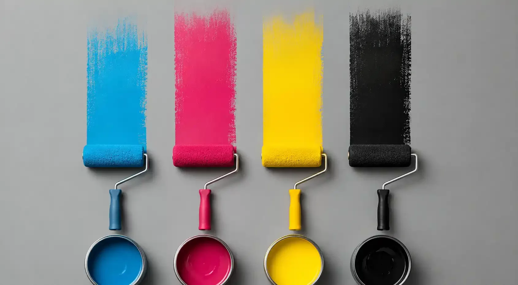
What Do CMYK Percentage Values Mean? The Effect of Each Ink
When you raise the cyan percentage, blue and green tones get stronger. Saturation clearly climbs. However, if you go too far, colors turn cold.
The magenta ratio sets the warmth. High magenta brings pinks, purples, and reds to life. Low magenta creates a greenish dullness. That is why adjusting the magenta-cyan ratio is a true balancing act.
The yellow channel adds brightness and warmth. If you overdo yellow, everything shifts to green or brown. Using the right dose makes a huge difference.
The black channel delivers contrast and detail. C0 M0 Y0 K100 gives you pure black. Tone and depth fall fully under the black channel’s control. Plus, this is the first thing you think of when you hear the term CMYK black color code.
Think about these four values together. None of them means much alone. Grasping the push and pull between CMYK tones takes practice.
In short, the process of calculating CMYK color codes finds its answer through this hands-on work.
Are CMYK Codes from ChatGPT, Midjourney, and Other AI Tools Reliable?
AI tools are spreading fast. Models like ChatGPT and Midjourney can also produce CMYK codes. But trusting these codes blindly is a big mistake.
I run into AI color conversion errors very often. No designer escapes the problem of CMYK matching with AI. These models cannot convert without visual perception loss. Plus, they do not factor in complex models like the Neugebauer equations.
If you send a file to print without verifying the AI output, the result will be a disappointment. AI cannot fully compute the color gamut due to its limits. In short, the values it gives are usually too saturated.
The images Midjourney creates are RGB. When you convert them to CMYK, the colors fly away. I always check AI outputs in Photoshop and fix them by hand.
Always do a soft proof. Measure the Delta E deviation value. Do not approve anything without seeing it with your own eyes. Remember, even lookup table color matching beats an AI guess.
CMYK Conversion in Adobe Photoshop & Illustrator
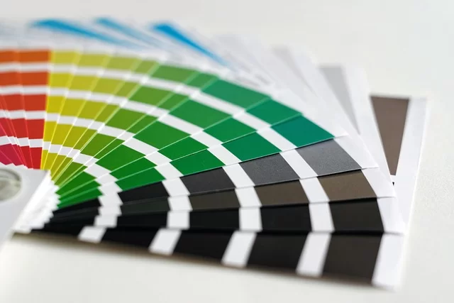
Adobe software offers the strongest tools for color management. You can switch to CMYK in Photoshop with just a few clicks. However, you must know the right settings.
Picking the wrong profile ruins all your work. The Color Settings menu can feel confusing. I will walk you through it step by step. Also, I will show you how to save in CMYK format.
Switching to CMYK Mode in Photoshop: Correct Color Settings and Profile Choice
First, open Color Settings from the Edit menu. Choose CMYK as your working space. You will see profiles like Fogra39 or ISO Coated v2 here.
Fogra39 is the most common choice for European standards. It is ideal for coated paper. If you use uncoated paper, pick a different profile.
With that in mind, here are the steps you need to follow if you wonder how to open CMYK mode in Photoshop:
- Go to Edit > Color Settings.
- Under Working Spaces, pick Fogra39 for CMYK.
- Set Color Management Policy to “Convert.”
- Follow the path Image > Mode > CMYK Color.
Next, go to the Mode section under the Image menu. Click the CMYK Color option. Photoshop converts the colors right away. After that, it pulls out-of-gamut colors to the nearest tone on its own.
Do not skip soft proofing before the conversion. Open Proof Setup from the View menu. Watch the print simulation with the profile you picked.
Always check the total ink limit value. For Fogra39, this value is usually around 330%. Too much ink buildup makes drying take longer.
Prepress Color Check and Soft Proofing in Illustrator
To convert to CMYK in Illustrator, choose Document Color Mode from the File menu. Click CMYK Color. Your vector design updates to match.
Then open Proof Setup from the View menu. Make your Fogra profile choice here as well. Check the design while the soft proof warning is active. Also, if you ask how to make a CMYK PDF, these settings are crucial.
Soft proofing shows you how the print will look. If your screen is calibrated right, the result will be very close. Skipping this step is a big risk. If you ask why color loss happens in print, the answer often hides right here.
Also, open the Separations Preview panel. Check each ink channel one by one. You will catch any overprint issues here. You can even check quarter-tone and half-tone values from this panel.
For prepress color checks in Illustrator, turn on Overprint Preview too. This lets you simulate the real image that will come out in print. With that, you also see the half-tone screen effect here.
Rich Black and the Secrets of Black in the Print Shop
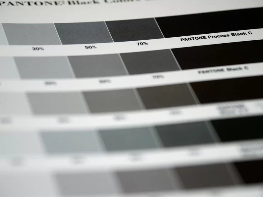
Pure black sounds good enough, right? The formula C0 M0 Y0 K100 gives you black. But when it hits the press, it falls short. You see a dirty gray, especially on large areas.
Rich black steps in right here. You add the other three colors to the black. The result is a deep, thick, and full black.
Using rich black is a must, especially for big background areas. Otherwise, you end up with the pale result we call press black. So, choosing the right rich black CMYK value decides your project’s fate.
The Best Rich Black Values: Cool, Warm, and Neutral Black Formulas
Rich black CMYK values change based on your goal. Here are the most common formulas:
| Black Type | C | M | Y | K | Use Case |
|---|---|---|---|---|---|
| Pure Black | 0 | 0 | 0 | 100 | Small text, thin lines |
| Cool Black | 60 | 0 | 0 | 100 | Tech drawings, modern designs |
| Warm Black | 0 | 60 | 40 | 100 | Warm-toned photos, vintage designs |
| Neutral Black | 60 | 40 | 40 | 100 | General use, large backgrounds |
| Deep Black | 40 | 30 | 30 | 100 | Safe choice for offset printing |
A cool black CMYK recipe gives a blue undertone. A warm black carries a brown undertone. Which one you pick depends fully on the soul of your design.
The best rich black code shifts from project to project. However, the C60 M40 Y40 K100 formula is the gold standard in the field. It stays under the total ink limit of 240%.
Registration black is a very different thing. You set all channels to 100% and use this color only for registration marks. It must never appear in your design.
How to Prevent Overprint Black Errors and Registration Issues
The overprint black error was one of the most costly lessons of my career. Years ago, I was prepping a catalog for a big company. But I forgot to set black text to overprint.
The result: the background color showed through under the white letters. We threw away 10,000 catalogs. The cost of that print error hit $1,350.
The overprint feature lets black ink overlap with the colors below. If you turn it off, knockout happens. The software deletes the color underneath. As a result, you see a white gap on screen.
Registration errors add to the trouble. When plates shift by a hair, white lines show up. Adding bleed largely solves this problem.
Check the overprint setting in Illustrator’s Attributes panel. Keep this feature turned on for all black text. Do not forget registration marks. With that, set trapping values by asking your print shop.
Advanced CMYK Color Management: ICC Profiles, Fogra Standards, and GCR/UCR
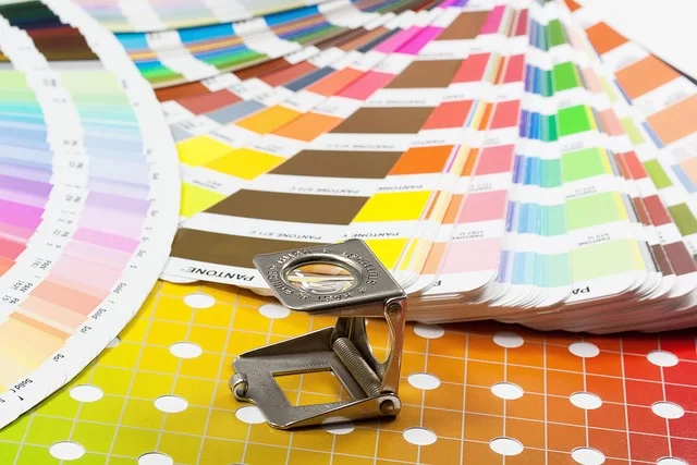
You cannot get consistent prints without a color management system. The link between ICC profiles and CMYK is the backbone of the whole process. You must know that every device reads colors in its own way.
That is why they built standard profiles. Groups like Fogra and Idealliance set the print standards. You can cut down surprises by using these profiles. Also, Idealliance standards are common, especially in the US market.
Differences Between Fogra39, ISO Coated v2, and Fogra27: Which Is the Best Print Profile?
Fogra39 is the most common offset print profile. Developers built this profile just for coated paper. Its color gamut is quite wide. Most print shops in Europe use this profile.
ISO Coated v2 is actually the standardized version of Fogra39. The gap between them is tiny. However, ISO Coated v2 gains more global acceptance.
Fogra27 is for matte coated paper. Since ink absorption is higher, gamut compression happens. Colors come out a bit paler. So, the gap between Fogra27 and Fogra39 comes down to this absorption rate.
US Web Coated SWOP is common in the American market. Developers designed this profile just for web offset presses.
If you ask which is the best CMYK print profile, the clear answer is: ask your print shop. Every master suggests a profile based on their own calibration.
| Profile | Paper Type | Total Ink Limit | Region |
|---|---|---|---|
| Fogra39 | Coated | 330% | Europe |
| ISO Coated v2 | Coated | 330% | International |
| Fogra27 | Matte Coated | 300% | Europe |
| US Web Coated SWOP | Coated (Web) | 300% | North America |
What Are GCR, UCR, and Total Ink Limit (TAC)? Optimizing the Color Separation Process
GCR, or gray component replacement, is a smart technique. It spots neutral gray areas during color separation. It cuts back cyan, magenta, and yellow while boosting black.
This way, total ink use goes down. Drying speeds up and costs drop. Moreover, gray balance becomes more stable.
UCR, or under color removal, is an older method. It works only in dark shadow areas. It is not as broad as GCR.
The total ink limit, or TAC value, is vital. If you pass this limit, ink bleeding happens. The paper stays wet and sheets stick together.
The CMYK separation process takes shape based on these settings. With the right GCR settings, you can save up to 20% on ink. With that, you can optimize the steps of the CMYK color separation process as follows:
- Analyze the image and spot neutral areas.
- Set the GCR level to medium or high.
- Limit the total ink based on the paper type.
- Choose the black channel generation method.
- Keep the gap between UCR and GCR in mind.
Definitive Fixes for Color Shifts, Fading, and Dullness in CMYK Printing
Do you feel sad when you see the printed job? Colors faded, blue turned purple, red shifted to orange? Every one of these problems has a fix.
Everyone asks why a design comes out dull in print. The answer is almost always a lack of color management.
If you do not build a bridge between your screen and the press, this is the result. Also, if you wonder why CMYK prints look washed out, you have hit the gamut wall.
Why Does CMYK Blue Turn Purple? Magenta-Cyan Balance & the Fix
The complaint “CMYK blue turns purple” is the one I hear most often. The cause is simple: a cyan and magenta imbalance. Print machines tend to lay down a bit too much magenta.
To fix it, lower the magenta value in your blue. Keep cyan at 100% and pull magenta below 70%. Make the gap between them at least 30%.
Use this formula to stop blue from mixing wrong: C100 M70 Y0 K0. This gives pure blue. For darker tones, try C100 M80 Y0 K30. With that, a blue-green color shift also comes from a similar imbalance.
To avoid color shift issues, always get a proof print. Have the Delta E deviation value measured. Then, if it stays within tolerance, give your approval.
Why Can’t You Print Neon and Bright Colors in CMYK? Alternative Methods

Neon colors push past the CMYK gamut limits. Pigments are just not vivid enough on a physical level. So, you cannot print these colors. They cannot match the light power of a screen. CMYK neon printing sounds impossible because it is.
Colors you cannot print with CMYK include neon green, bright orange, and electric blue at the top of the list. You need to use spot colors for these.
The answer to why neon colors cannot be printed in CMYK hides in the laws of physics.
How do I print neon colors in CMYK? Answer: you cannot print them directly. That is when Pantone spot colors come into play.
Printers run these special inks as a separate unit. For example, pick Pantone 802 C instead of neon green CMYK printing.
A system called extended gamut printing is another option. With CMYKOG, or six-color printing, you add orange and green. The gamut expands this way. You can even get close to neon tones thanks to hexachrome printing.
Can you do metallic color printing with CMYK? No, you cannot. For gold and silver, you again need spot colors or foil stamping. Also, for bright blue in CMYK, C100 M70 Y0 K0 is ideal.
Color Fading and Dullness in Print: Stopping Loss During RGB to CMYK Conversion
A strategy to stop RGB-to-CMYK fading starts at the design stage. If you begin your design in CMYK mode, you avoid loss. Starting in RGB and converting later always brings loss.
Why do CMYK prints look washed out? Because the RGB color space is much wider than CMYK. Gamut compression is a fact of life. Bright blue takes a big hit, especially during CMYK conversion.
To cut this loss down, push saturation a bit too far. Boost contrast after the conversion. Make small tweaks from the Levels panel. With that, the fix for CMYK color fading hides in these small touches.
Also, screen calibration is a must for color accuracy. Do not trust any color you see on an uncalibrated screen. Always check the Delta E color difference tolerance value.
CMYK in US Print Shop Practice: Paper Types, Screen Ruling, Cost, and Prepress Checks
Printing is a deep-rooted trade in the United States. But there are still serious issues with color management. Most shops skip press calibration.
I will focus on local print shop practice in this section. I will cover every detail from paper type to screen ruling.
How to Set CMYK Values for Coated and Uncoated Paper? The Ink Absorption Effect
Coated paper has high gloss. Ink stays on the surface and looks vivid. That is why coated paper colors are richer. So, you can push the total ink limit up to 330%.
Uncoated paper absorbs a lot. Ink soaks into the paper. Colors turn dull and spread out. For this reason, keep the total ink ratio under 260%.
When setting CMYK values based on paper type, also factor in dot gain. Dot gain can reach up to 25% on uncoated paper. On the other hand, it stays around 15% on coated paper.
The gap in ink absorption directly affects color richness. Prepare your colors a bit more vivid for uncoated paper printing. Otherwise, the result comes out very pale.
| Parameter | Coated Paper | Uncoated Paper |
|---|---|---|
| Total Ink Limit | 320-330% | 250-260% |
| Dot Gain | 12-15% | 20-25% |
| Color Saturation | High | Medium-Low |
| Drying Time | Fast | Slow |
Screen Frequency (LPI), Screen Angles, and How to Prevent Moiré Patterns
Screen frequency is the number of dots per inch. As the LPI value goes up, print quality improves. But the paper quality must match it too.
On coated paper, 175 LPI is the standard. On uncoated paper, 150 LPI is ideal. For newsprint, you drop down to 85 LPI. So, screen density sets the level of detail in your work.
Screen angles differ for each color. You set cyan at 15°, magenta at 75°, yellow at 0°, and black at 45°. These angles stop moiré patterns. With that, you will face trouble if screen angles stray from the standard.
To stop screen moiré, stick to these standard angles. If you change them, wavy, ugly patterns form. The cost to fix this error is high. Also, screen ruling directly impacts print quality.
CMYK Use in Offset Printing and Cost Analysis: Waste, Ink, and Plate Expenses
CMYK use in offset printing directly affects cost. Each color means a separate plate. Four-color printing needs four plates.
Plate cost runs between $5 and $9 per plate. You should budget $20 to $36 total for four plates. This cost makes printing expensive at low quantities.
You must also factor in press waste. While setting colors, 50-100 sheets of waste is normal. Plus, this number grows on big jobs.
Ink cost in offset printing rises when you use rich black. You consume more ink. Also, labor costs climb because drying takes longer.
Total ink limit is critical in a CMYK print cost study. Working at 200% instead of 300% cuts costs by about 15%.
The cost of a wrong RGB print is far heavier. Reprinting files sent in the wrong color mode ruins the whole budget.
Special Use Cases: Digital Printing, Home Printers, Packaging Design, and Browsers
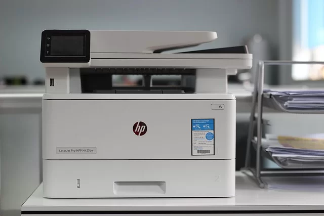
CMYK appears in every kind of print. But it behaves differently in each setting. The question of whether to use CMYK or RGB for digital printing can feel confusing.
Now I will go into detail on special cases. I will touch on everything from your home printer to packaging design.
CMYK Gaps Between Digital and Offset Printing: HP Indigo and Toner
The CMYK gap between digital and offset printing mainly comes from ink tech. In offset, they use liquid ink. On the other hand, digital uses toner or digital liquid toner.
HP Indigo machines use liquid toner. They give results closest to offset. The color gamut is quite wide. You can even do Pantone matching.
Machines with dry toner have a narrower color gamut. You will see shifts, especially in blue and purple tones. Delta E deviation tolerance runs higher.
The key point of CMYK in digital printing is this: calibration is vital. If you do not calibrate the machine regularly, you cannot keep colors consistent.
Why Do CMYK Images Look Different on Home Printers and Browsers?
Does a home printer use CMYK? Yes, it does. But the driver software auto-converts RGB to CMYK. Worse, this conversion is often low quality.
Why does a CMYK image look different in a browser? Browsers do not manage the ICC profile-CMYK link. They cannot read embedded profiles.
Colors look pale and dull. In browsers like Firefox, the color management policy is even turned off. To fix this, save your images with the sRGB profile.
Never save in CMYK format for the web. Keep your PNG files in RGB. The same rule holds true for JPEG format. Also, if you cannot print the color you see on screen and seek a fix, switch the format.
CMYK Color Management in Packaging Design: Flexo Printing and Spot Colors
Packaging design is the hardest area for CMYK color management. They usually pick Flexo printing. But this method is totally unlike offset.
In Flexo printing, the plate is flexible. Ink transfer works differently. Dot gain is much higher. For this reason, they build special CMYK color profiles for the packaging field.
Packaging design does not rely on CMYK alone. Extra steps like spot colors, varnish coating, and foil stamping come into play. So, the gap between CMYK and Pantone is this: Pantone colors are custom-mixed spot colors.
If you wonder about the gap between CMYK and spot colors, a spot color is a ready-made mix. That is to say, you produce these colors through the four-color process.
Which is better, Pantone or CMYK? In packaging, Pantone is a must. Never leave brand colors in the hands of CMYK alone. So, leave the matching work to your print shop expert.
Golden Rules for a Pro CMYK Workflow and a Prepress Checklist
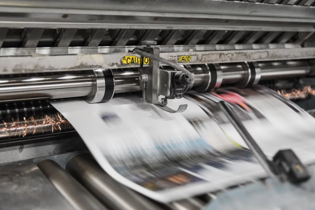
You must bring discipline to your prepress process. Here are the golden rules I have built through years of work:
- Always start your design in CMYK mode. See RGB conversion as a last resort. Also, designing in CMYK mode saves you from surprises.
- Set your working profile to Fogra39 from the Adobe Color Settings menu. Make sure the whole team uses the same profile.
- Do not exceed a total ink limit of 320%. The ideal value sits between 280% and 300%.
- Apply overprint to all black text. Otherwise, registration errors are bound to happen.
- Give at least 3 mm of bleed. Go up to 5 mm for large formats.
- Never send a file to print without soft proofing. Fix the colors that trigger a soft proof warning.
- Keep your images at 300 DPI resolution. Lower resolution reduces print quality.
- When saving as PDF, check the option to save in CMYK format. Embed the profile.
- Always ask your print shop for a proof print. If you cannot get the screen color in print, this is your last chance to fix that problem.
- Try to keep the Delta E deviation value under 3. View anything above 5 as unacceptable.
That is the core answer to what you should check before CMYK printing. Print this list and hang it on your desk. Check it off item by item on every project.
How do I verify color? Take a reading with a spectrophotometer. See if you stay within Delta E color difference tolerance limits.
What does dot gain mean? It is the growth of dots during half-tone screening. If you do not define this value correctly in your profile, everything comes out dark.
Common Mistakes When Using CMYK and Key Takeaways
On the other hand, if you ask what common mistakes people make when using CMYK, here are the ones I see most:
- Starting the design in RGB mode and converting later.
- Passing the total ink limit.
- Not checking overprint settings.
- Picking the wrong ICC profile.
- Using pure black instead of rich black.
Does color loss happen in print? Yes, it happens, especially with wrong profiles and conversions. But with the right management, you can cut it down to the bare minimum.
NOTE: Pro print shops often prefer the TIFF format. Its multi-page structure works wonders on big projects.
Further Reading Sources on the CMYK Color Model
The information I shared in this guide rests on the most up-to-date standards in the field. If you want to dig deeper, I suggest you review these trusted sources:
- The official site of the International Color Consortium, ICC profile specifications, is the top authority. You can find all color management standards there.
- Also, the Fogra Research Institute’s current print profile docs are a must for print pros. You can reach the tech details of profiles like Fogra39 and Fogra51 there.
- Adobe’s official color management docs serve as the primary go-to source for picking the right profile in Photoshop and Illustrator.
15 Critical Questions About the CMYK Printing Process
In short, what is the CMYK color model?
What is the difference between CMYK and RGB?
How do I switch to CMYK mode in Photoshop?
What is the rich black CMYK value?
Should I use CMYK or RGB in my design?
Can you print neon colors with CMYK?
Why does the letter ‘K’ stand for black in CMYK?
Why do colors come out pale or dull in print?
What is the difference between Pantone and CMYK? Which is better?
Is the CMYK code from ChatGPT or Midjourney correct?
Why does CMYK blue turn purple?
Why does a image look different in a browser?
How do you stop color fading in print?
Should I send a CMYK or RGB file for digital printing?
What should I check before sending a job to the press?
Conclusion: Full Control of CMYK Is the Key to Flawless Printing
You have stepped into the CMYK world. You now know what cyan, magenta, yellow, and the key plate do. Even more key, you have learned how to manage these four inks.
Do not forget that print perfection hides in the details. With the right profile, the right rich black, and the right overprint settings, the result always satisfies.
Start using what you learned today right now. You will see the gap in your very next print project. In the end, CMYK print quality is now in your hands!

Be the first to share your comment